
A good paint splash background isn't just there to fill a blank spot on the screen; it breathes life, energy, and a distinctly modern vibe into your work. Think of it as a shot of visual adrenaline—it grabs attention and gives marketers, artists, and creators a powerful way to make a real impression.
Why Paint Splash Backgrounds Make Your Designs Pop
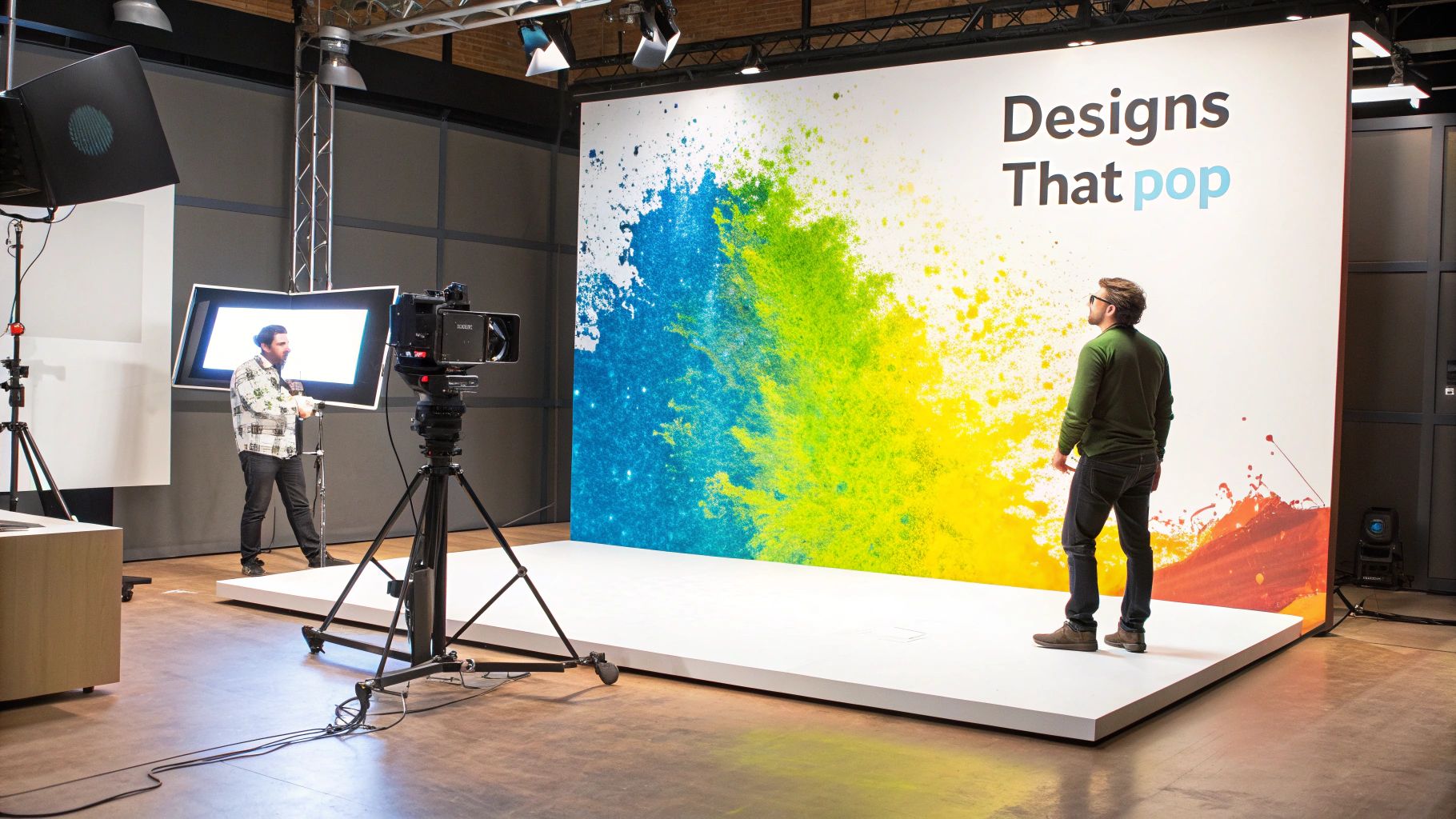
Before we jump into the how-to, let's talk about why these backgrounds actually work so well. At their heart, paint splashes scream spontaneous creativity and movement. They break you out of the rut of stiff, predictable layouts and instantly pull the viewer's eye where you want it to go.
Imagine you're launching a new product or rolling out a social media campaign. A plain, sterile backdrop can feel a bit soulless. But swap that out for a vibrant paint splash, and suddenly you're signalling innovation, excitement, and a touch of artistry. It’s a quick visual cue that tells your audience your brand is bold, fresh, and definitely not boring.
The Psychology of Energetic Visuals
Our brains are hardwired to spot patterns—and anything that breaks them. A paint splash is the perfect pattern-breaker. The controlled chaos of the splatters and drips creates a visual texture that holds our attention far longer than a solid block of colour ever could. It’s a huge advantage in a crowded social media feed where you only have a split second to stop the scroll.
On top of that, you get the psychological punch of colour. A splash of bright yellow can bring a sense of happiness and energy, while deep blue splatters might communicate depth and trust. When you use a paint splash background, you're doing more than just decorating; you're weaving emotional cues directly into your design. This subtle layer of influence can completely change how someone feels about your message or brand.
A paint splash background is more than a design choice; it's a strategic move. It uses the psychology of colour and motion to capture attention, convey a modern feel, and make any visual message more memorable.
A Powerful Tool in a Global Market
This isn't just a niche trend; it’s being used all over the world, especially in fast-moving creative markets. In India, for example, paint splash backgrounds have absolutely exploded in popularity, often drawing inspiration from the incredible colours of festivals like Holi. It makes perfect sense—these visuals tap right into a cultural love for vibrancy and celebration.
With over 500 million active social media users in India, creators need visuals that stand out. Design agencies have even reported that using splash effects can boost engagement by a whopping 35-40%. You can learn more about how these visuals fit into current trends in Indian graphic design.
Once you understand the impact these backgrounds can have, you can tackle the rest of this guide with a real sense of purpose—whether you’re designing for a huge global campaign or just a one-off social media post.
Common Applications for Paint Splash Backgrounds
Here’s a quick look at where paint splash backgrounds are most effective and the typical impact they have on engagement.
| Use Case | Primary Audience | Typical Engagement Lift |
|---|---|---|
| Social Media Ad Campaigns | Gen Z, Millennials | 25-40% |
| Event Promotion Posters | Creative Professionals, Students | 20-35% |
| Website Hero Banners | Tech Startups, Artistic Brands | 15-30% |
| Product Launch Announcements | E-commerce Shoppers | 30-45% |
| YouTube Thumbnails | Vloggers, Content Creators | 10-25% |
As you can see, the energetic and eye-catching nature of these designs translates directly into better performance across a whole range of uses.
Writing Prompts for the Perfect Initial Splash
Everything starts with the prompt. Getting a powerful result right out of the gate means moving beyond vague requests. Instead of just typing in "paint splash," you need to think like an art director giving very clear instructions.
The trick is to be specific. Don't just describe the action; paint a complete picture of the scene in your mind. What kind of paint is it? What surface is it hitting? What's the overall mood? A well-crafted prompt is like a recipe for the AI—the better your ingredients, the tastier the final result.
Building a Detailed Prompt
I find it helps to build prompts in layers. Each piece of information you add gives the AI another crucial clue about what you’re trying to achieve.
- The Action and Medium: Kick things off with the core idea, but get specific about the material. Are you picturing "thick acrylic paint" that shows every brushstroke, or maybe "runny watercolour" that bleeds softly into the background? This choice alone has a huge impact on the final look.
- The Surface: Think about where the paint is landing. A phrase like "on a textured canvas" immediately gives it an artistic, gritty feel. On the other hand, specifying "against a clean white wall" pushes the generation towards something more modern and crisp.
- The Mood and Style: What feeling are you going for? Words like "energetic and chaotic" will give you something explosive and dynamic. If you need a more controlled, polished look, try adding "minimalist and elegant splatters" to your prompt.
The real magic happens when you go beyond just telling the AI what to make and start telling it how to make it. Those few extra descriptive words can be the difference between a decent image and a brilliant one.
For instance, you could start with a simple prompt: paint splash background.
But a much more effective prompt would be something like this: Thick, vibrant acrylic paint splashing energetically across a dark, textured canvas, creating a chaotic yet beautiful background, photorealistic. See how much more information the AI has to work with now?
Ready-to-Use Prompt Templates
To help you get going, here are a few templates I’ve had success with in tools like Glima AI. Feel free to swap out the colours, textures, and styles to see what you can create. For more inspiration, you can always check out Glima's free AI drawing prompt generator.
- For a bold, modern look:
A dynamic splash of neon pink and electric blue gouache paint exploding against a matte black background, high contrast, studio lighting. - For an elegant, soft feel:
A delicate splatter of gold and white ink on textured watercolour paper, minimalist, elegant, with soft focus. - For a gritty, urban vibe:
Multi-coloured spray paint splatters and drips on a weathered concrete wall, street art style, gritty texture.
If you really want to get the most out of the AI and guide it with precision, it's worth learning more about the art of Mastering Prompt Engineering. Putting a little extra thought into your prompts upfront will save you a ton of time on revisions later and get you to a fantastic result much, much faster.
Using Styles and Reference Images to Guide Your AI
A detailed text prompt is a great starting point, but the real magic happens when you start layering in styles and visual references. This is how you steer the AI from creating a generic paint splash to something with a distinct, deliberate personality. You’re not just telling it what to make, but also how it should feel.
Something as simple as applying a pre-set style in a tool like Glima AI can instantly shift the entire mood of your image. Honestly, this one step can be the difference between a flat, uninspired design and a dynamic masterpiece.
Injecting Personality with Artistic Styles
Think of styles as your creative shortcuts. Instead of trying to describe every tiny detail of an artistic movement within your text prompt, you can just apply a style tag. This tells the AI the entire aesthetic you're aiming for, saving you a ton of time and often producing much more authentic results.
Just look at the kind of transformations you can achieve:
- Pop Art Style: This will instantly give you those bold outlines, super-saturated colours, and a high-contrast vibe that feels like it’s straight out of a comic book. It’s perfect when you need something with a lot of energy.
- Photorealistic Style: If you're after a splash that looks like it was captured in a studio with a high-speed camera, this is the one. The AI will focus on getting the textures, lighting, and sense of depth just right.
- 3D Render Style: This creates a paint splash background that feels like it has real volume and dimension. The splashes get these clean, sculpted edges, giving them a tangible, almost physical presence.
For a deeper look at the possibilities, it’s worth exploring the various image styles in Glima AI to find the perfect fit for your project.
The Power of Reference Images
This is where you can get incredibly specific and really align the AI’s output with your vision, especially for things like brand identity. A reference image works like a visual brief, giving the AI a concrete example to follow for colour, texture, or even composition.
Let's say you're working on a new product launch for an e-commerce site. You could upload a simple image of your brand's official colour palette. By feeding the AI that reference along with a prompt like "energetic paint splash," it will generate splashes using your exact brand colours. It’s a seriously powerful way to maintain consistency.
Using a reference image isn't about copying; it's about influencing. You're giving the AI a visual anchor, guiding its creativity toward a result that is both unique and perfectly on-brand.
This level of customisation is vital in crowded markets. In fact, the commercial use of paint splash backgrounds is booming right now, particularly in India's design industry. Shutterstock currently has over 33,000 colour splash illustrations tagged with 'India,' which is a 28% jump since 2022. As digital ad spending continues to climb, these kinds of eye-catching visuals are essential for grabbing an audience's attention. By mastering styles and references, you can create assets that don't just look great, but also deliver real results.
How to Refine Your Splash with Masking and Layering
A good design often boils down to the details you finesse after the initial creative burst. Once your AI has produced a base image that you’re happy with, it’s time to take the reins and start refining. This is where you shift from being a prompter to an art director, making deliberate edits for a truly polished finish.
The real magic in post-generation editing comes from masking. This technique lets you isolate a single splash, or even just a tiny splatter, within your image. By selecting a specific element, you can tweak its colour, resize it, or shift it to another part of the composition without messing up everything else around it.
Gaining Precise Creative Control
Let's say you've generated a stunning, chaotic paint splash background, but one of the key splashes is just a tad too dark. With masking, you can zero in on that single splash and brighten it. Or maybe you love the overall feel but need to clear some space for a logo in the top-left corner. Simple. Just mask the splashes in that area and either delete them or scale them down.
This kind of control is what separates an amateur design from a professional one. You're no longer stuck with the AI's first draft. Instead, that initial generation becomes your raw canvas—something you can mould and perfect.
Combining AI generation with your own manual touch gives you the best of both worlds: the speed and endless ideas of the AI, plus the precision and artistic instinct that only a human brings to the table. It's a workflow that consistently delivers better results.
Combining the Best Elements with Layering
Layering takes this a step further by letting you cherry-pick the best bits from several different AI generations. It's pretty rare for a single generated image to be absolutely perfect. More often than not, you'll get one image with a fantastic, dramatic central splash and another with the perfect subtle splatter texture for the background.
This is exactly where layering shines. You can use masking to lift that high-impact splash from the first image and place it onto a new layer over the second one. Think of it like building your ideal paint splash background piece by piece, almost like a digital collage.
For even more granular control, you can dig into techniques like AI inpainting, which lets you selectively regenerate or remove parts of your image with uncanny precision. You can learn more about AI inpainting and add another powerful tool to your creative toolkit.
The diagram below gives you a bird's-eye view of the typical AI art generation flow, which is the starting point for all these refinement techniques.
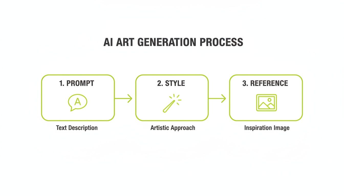
This process shows how your initial prompt, chosen style, and any reference images all feed into that first version. From there, you can take that output into the layering and masking stage to really make it your own.
Adjusting Colours and Textures for a Professional Finish
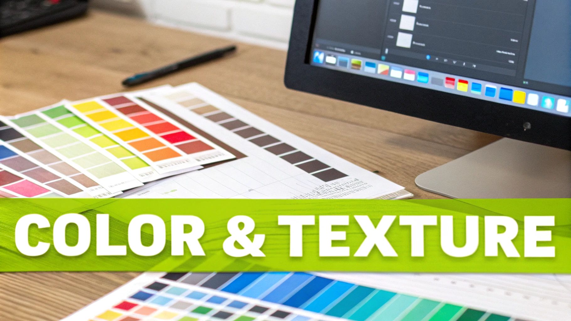
So, you've got the basic shape of your paint splash sorted. Brilliant. But now comes the part that separates a good design from a great one: the refinement. This is where we dial in the subtle details of colour and texture to really nail the mood and give it that professional edge. It’s what turns a generic graphic into a bespoke asset that feels like it belongs to your brand.
The biggest win here is achieving brand consistency. It’s easy enough to prompt for a “blue” splash, but getting it to match your brand’s specific hex code for navy blue is a whole other ball game. That kind of precision is what makes marketing materials feel cohesive and instantly recognisable.
Fine-Tuning Your Colour Palette
The most straightforward way to get your colours right is to tweak them after the initial generation. Most design tools, including the editor in Glima AI, have features for colour balance or replacement. This lets you pinpoint a colour in the splash and swap it out for your exact brand hex code. Simple, effective, and precise.
Another trick I often use is overlays. Let's say your generated splash has the perfect form, but the colours are just a little off. You can layer a semi-transparent colour block on top of it. This tints the whole image, subtly shifting the hue to match your brand palette without destroying the beautiful textures and details underneath.
The goal is to make the paint splash background feel intentional, not just a random element. Matching colours precisely to your brand guide is a non-negotiable step for any professional project.
This attention to detail is crucial, especially in busy commercial spaces. For example, paint splash backgrounds have become a staple in India's booming e-commerce and influencer markets. Online marketplaces are filled with sellers offering prints and digital downloads at competitive prices, making it incredibly easy for brands to grab and customise visuals for their campaigns. You can see how these visuals are priced and sold in the Indian market to get a sense of the demand.
Manipulating Textures for a Specific Feel
The texture of your paint splash gives it a physical quality. Are you going for a thick, gritty acrylic look, or something more like a smooth, watery wash? Your prompt gives you a head start, but the real magic happens in post-editing.
To get the texture just right, start playing with sharpening and blurring tools.
- For a gritty, tactile effect: A sharpening filter can really bring out the tiny details and edges of the paint, making it feel more textured and real. I also like to overlay a subtle grain or canvas texture to push it even further.
- For a smooth, liquid appearance: A touch of blur or a noise reduction filter can soften any harsh edges, giving the paint a more fluid, glossy finish that looks like it's still wet.
Prompt Modifiers for Texture and Color Control
To give you more control right from the start, here are some prompt keywords I've found useful for influencing texture and colour directly in the AI generator.
| Desired Effect | Prompt Keyword Examples | Best For |
|---|---|---|
| Rich, Saturated Colour | vibrant, rich hues, saturated palette, jewel tones |
Creating bold, eye-catching backgrounds that demand attention. |
| Muted, Subtle Tones | pastel colours, muted tones, soft palette, desaturated |
Projects that require a softer, more sophisticated or minimalist aesthetic. |
| Gritty, Heavy Texture | thick impasto, gritty texture, acrylic on canvas, heavy body paint |
Adding a sense of depth, realism, and a handmade feel to the design. |
| Smooth, Liquid Feel | liquid ink, watercolour wash, fluid motion, glossy finish |
Achieving a clean, modern, and elegant look, perfect for digital media. |
| Metallic Sheen | gold leaf flecks, metallic sheen, iridescent, liquid chrome |
Adding a touch of luxury and dynamism to your background. |
Using these modifiers can save you a ton of editing time later on by getting you closer to your final vision straight out of the gate.
Ultimately, these adjustments ensure your background works in harmony with everything else in your design. Whether it’s sitting behind crisp text, a product shot, or your company logo, a well-balanced composition is what creates that polished, professional look we’re all after.
Upscaling and Exporting Your Final Design
So you’ve created a stunning paint splash background. The colours pop, the composition is dynamic, and it’s ready to go. But what happens next is just as important as the creative process itself.
An image that looks perfect in the generator can easily become a pixelated mess on a high-resolution screen or a muddy disappointment in print. Getting your design ready for the real world is the final, crucial step to make sure all your hard work pays off.
Upscaling to Professional Quality
The first thing to tackle is resolution. Most AI-generated images start life at a standard web resolution—great for a quick preview, but not nearly enough for a large website banner, a high-quality print, or a crisp presentation slide. This is where upscaling comes in.
Upscaling intelligently increases the image’s size and pixel count without the blurriness you get from just stretching a small image. It’s a non-negotiable step for any professional project. A good approach is to upscale images with AI, which can produce some seriously impressive results. For more granular control, you can also check out the dedicated image upscaler in Glima AI.
Choosing the Right Export Settings
With your design scaled up and looking sharp, it’s time to save it. The file format you choose has a huge impact on quality, file size, and how you can use the image later on. This isn’t a one-size-fits-all situation; picking the right format for the job is key.
Here’s a simple breakdown of the main players:
- JPG (JPEG): This is the workhorse for anything on the web. It’s perfect for blog images, social media posts, and anywhere you need a smaller file size for faster loading. Just be aware that it compresses the image, which can cause a tiny bit of quality loss.
- PNG: The superpower of PNG is transparency. If your paint splash needs to float over other content without a solid background box, this is the format you need. It’s essential for creating flexible design assets.
- TIFF: When quality is everything, TIFF is your answer. It’s a “lossless” format, which means no detail is lost when you save it. This makes it the top choice for professional printing, though it comes with a much larger file size.
Think about where your design will ultimately live. A PNG might look fine for a print job, but a TIFF guarantees that every single drop of paint you perfected makes it to the final page. Making this small choice is how you protect the integrity of your work.
Got Questions About Paint Splash Backgrounds?
As you start working with AI to create visuals, a few questions tend to come up again and again. Getting these sorted will help you smooth out your process and open up some cool new ideas for your paint splash designs.
One of the biggest things people ask about is transparency. It’s a game-changer for making flexible design assets, letting you drop your splash onto any backdrop without that ugly white box around it.
Can I Make a Paint Splash with a Transparent Background?
You sure can. Nearly all serious AI art platforms, like Midjourney or Stable Diffusion, have a feature to remove the background after the fact. Once you’ve generated a splash you love, just run it through their background removal tool. This isolates the paint itself.
From there, save it as a PNG file. This format is your best friend because it supports transparency, making it super easy to layer onto websites, product mock-ups, or social media graphics.
Taking this extra step turns a simple picture into a truly versatile design element. A single paint splash with a transparent background can be used over and over in dozens of projects, giving you a lot of bang for your buck.
How Do I Get the Splash to Match My Brand’s Exact Colours?
When it comes to branding, getting the colours right is non-negotiable. The most foolproof way to do this involves a little post-generation editing.
First, prompt the AI with a colour that’s in the right ballpark—something like, “a splash of crimson red paint.” Once you have the image, bring it into an editor like Canva or Photoshop. Here, you can use a colour replacement tool or just apply a colour overlay. Punch in your brand’s specific hex codes, and voilà—a perfect match.
This little bit of extra work guarantees that every visual you create is perfectly in sync with your brand identity, keeping everything looking polished and professional.